Thursday, 10 March 2011

A Message to the Moderator

Dear Moderator, this blog is now complete and ready to be assessed.

Blog Contents

October - November
Music video research & planning

November - December
Print production research & planning

End of December
Last few posts on music video planning
Completed print production

January
Filming begins

February
Finished music video

March
Evaluation


Friday, 4 March 2011

Q4: How Did You Use Media Technologies in the Construction and Research, Planning and Evaluation Stages?

I have used technology religiously throughout my year as an A2 media student. It is the most important part of the coursework, without which I wouldn't have been able to easily research into existing similar products, communicate with my target audience or make the video or print production itself.  

Media 2.0


I have used Youtube a lot through all the stages of my coursework. It has been useful not only because of the ability to research into existing products but also to find tutorials to increase our skills with the editing suites. For example it was key for our narrative that we included a split screen effect, and so we looked up how to create this in Adobe Premiere Pro.


Facebook was my main way of communicating with both my audience and my cast. I used it to send group emails to those taking part in the video to organise times and places as well as using it for audience feedback purposes. However audience feedback grew to be problematic where Facebook was concerned. Many were interested and happy to watch the videos but became reluctant to answer the questions and provide useful comments due to the sheer amount of other media students doing the same thing.


I spent a long time on Myspace in the initial stages of planning to find our artist and song. Once decided upon our artist I used his Myspace to find out key information, such as whether he was signed to a label or not and the artists he claims to be similar to (for inspiration.)


I also used music software Spotify's related artist feature to find artists similar to the one I had chosen and then look up their music videos for inspiration.


I have used Blogger greatly through my A level course. The website has allowed me to present my coursework effectively and interestingly as I am able to embed HTML codes to include videos and powerpoint presentations from other websites such as Youtube and Slideshare.

My mobile phone became key to the organisation of my music video cast, meetings and focus groups. Initially I would create an even on Facebook informing them all of the filming times and locations however it was through my phone that I was able to remind them to make sure they turned up.

Production


My Nikon D40 was very important where my print production was concerned as it enabled me to take high mega pixel shots which made the editing process in Photoshop easier. With it's range of features such as the auto focus and ISO levels I was able to take successful shots.


Jess and I were very lucky to have access to a Panasonic HDV camera to use throughout our music video production. Having previously used a DV camera whereby it is recorded on a tape and each clip has to be 'captured', I found the HDV camera a lot easier to use because of it's SD card. When teamed with a tripod we were also able to create pan shots like that in proffesional music videos.


Editing

I chose to use Adobe Photoshop CS5  when editing my print production work as it was easy to manipulate images. I used the RGB curves filters and the effects, particularly vignette, a great deal when trying to replicate a vintage image. The colour dropper tool enabled me to make sure the colours were the same where appropriate to make it coherent.

For our music video task the only software we used was Adobe Premiere Pro. This allowed us to easily import and organise (through the use of folders) our video clips and arrange them. We used the razor tool to  discard any unwanted bits of film  and to create effective cuts. We also used this tool to precisely cut our clips to ensure the lip sync was spot on. However I do think we were limited in our choice of video effects. Initially we had wanted to include a film grain however the only option available didn't show up very well so we had to discard it. That meant we had to rely on the filters to make certain sections of our video look vintage. This technological determinism shows how technology has had a power over my work.


Q3: What Have You Learned From Your Audience Feedback?

Throughout the process of creating all three products I have frequently asked my target audience for feedback to ensure I was appealing to them. I used a variety of platforms to discuss my products with my audience such as Facebook, class comments and face to face. My final audience feedback upon completing my music video was to see if what I had created was successful.

I gathered three people I believed to be in my target audience. These people are:
  • Hedonists
  • Students
  • C1- B demographic
  • 16-21


The video's narrative was a key feature due to it's entropic and ambiguous style. We deliberatley made it so the video could be interpreted in different ways. However from their answers it is  clear that the narrative has not been completely understood. There ideas on the narrative varied from "suicide" to "travelling" showing a negotiated reading of the text. My focus group may not have had the right cultural capital (perhaps they are not regular music video watchers) to understand or perhaps this shows that the narrative was too entropic for even our target audience to comprehend or interpret. Based on comments such as "Why were there girls in a car?" and "Why was he hung?" it is obvious to me that I need to make my narrative clearer. 

I also presented my video to my media class who have a range of interests and demographics but being media students can comment on the video more technically. The consensus was that our video fitted the indie/folk genre due to the use of filters to give the vintage look. It was also said that our 'locations suited the song' and our 'setting suited the genre' showing that generally they gave a preffered reading.


Q2: How Effective Is The Combination Of Your Main Product And Ancillary Texts?


Aspects I would change:
  • My music video itself is purposefully incoherant to distinguish the different narratives, but the sections are mostly coherant. The only incoherency is between the wooded shots with the protagonist and where the extras come in. This is because the latter was shot on a different day when it was significantly sunnier. If I was to reshoot my video I would make sure each section was shot on the same day to increase coherency.
  • I would make the colours between the advert and the digipak the same or more similar so they can be more easily recognised as part of a marketing package.


To conclude, the house style for my productions is one which contains vintage filters with nostalgic themes and outdoor locations. Although there is a difference in colour and character I think the audience was still able to recognise the artist through the house style created.

Evaluation Q1: In What Ways Does Your Media Product Use, Develop, or Challenge Forms and Conventions of Real Media Products?

Music Video Evaluation:


Print Production Evaluation: 

For my print production I took a lot of inspiration from the indie genre whereby I used filters and effects to connote nostalgia and vintage. This does not challenge the conventions of similar media products as it is typical for folk artists to incorporate the indie genre in both their music and products and often call themselves 'indie/folk artists.' My print production, along with existing products, try to give an image relevant to the auteur theory (whereby they are not influenced my 'mainstream hype' and have individual ideas determined by their creativity alone.) However this once niche genre is becoming more and more mainstream making it cohere to Adorno's theory of popular media and music products being characterised by standardisation.

This image is quite redundant because folk artists tend to use either an image containing an illustration or a scenic shot, I had also previously found that artists of the genre don't tend to use an image of themselves, which is something else I've conformed to. 

Monday, 3 January 2011

Research and Planning: Cast Organisation

After contacting him and making sure he's available, Jess and I have assigned the role of the protagonist in our music video to Alex Rainsford.


Alex on Facebook

Although he doesn't attend the same college as Jess and I, Alex assures us he'll be available for the times we need to film. He already has a folky look about him and being a singer himself will feel comfortable performing and lip syncing.

We discussed who should play the role of the main hanged person, which  is an important role as the character will get a lot of camera time in the first section of the video, and decided Emma Harrison would be perfect for it. She is outgoing enough to feel confident in the role but also does media as well so will understand the seriousness of the video and what we need to achieve.

Emma on Facebook

Jess and I have also created a Facebook event for the main cast as well as the extras we'll need for the last scene in the video. We've made it an open event, meaning anyone can invite others to join which will hopefully end up with us having a crowd of people required for the end of the video when the main character is surrounded by the dead people he has saved.


Tuesday, 28 December 2010

Research & Planning: Prop List

I've quickly put together a prop list of the key items needed in the video. Thankfully most are easy to get hold of, the only one we were having difficulty was the rope which luckily Jess looks to have sourced from a friend free of charge. However it's come to light now that we also need to find a chair after being unable to get one from home ourselves and so I've sent out a group email to my friends to see if they have one they could lend.

The props we will need are:

A rope - This will hopefully be supplied by a friend of Jess'
A ladder - Jess has sourced this from home.
Chocolate - This can easily be bought cheaply.
A car - For the home video scene to be shot inside, hopefully supplied and driven by Jess' mum.
A bike - I've found a friend who is keen to be a part of the video and is willing to supply his bike.
Makeup - The actors playing dead people will need a bit of makeup under the eyes which I can provide.

Jess and I have also come up with a way for the rope to be safely constructed yet still believable and Jess has drawn a diagram to show this:

Wednesday, 15 December 2010

Research & Planning: Audience Print Production Feedback

I posted images of my unfinished print production onto Facebook and tagged the people I thought were most like my target audience. This was to make sure it was appealing and relevant to my audience and the genre. With regards to my advert the response was very positive with comments such as:

Josh Taylor - "I think it's very good, the colours work and everything"

Emma Harrison - "I really like it! I think you need to move the "CD out now" slighly to the left"

Leah Dennison - "Love the photo, but I agree the text needs to move slightly"


And these were some of the responses to my digipak:

Emma Harrison - "I like it but I think you could change the font for the title"

Josh Taylor - "Not such a fan of the back cover, maybe you could make it more textured?"

Milly Morris - "I think it's really good! I agree with the others about the changes though"


From this feedback I will now go on to make the changes needed to my print production.

Tuesday, 14 December 2010

Research & Planning: Deadline Time Plan

The deadline for our print production is on friday so I will be spending a lot of time on Photoshop over the next few days to finish both my advert and digipak. Today I was told that it was possible to download a 30 day free trial of Photoshop which I will do later when I get home so I can spend some extra time editing.

Research & Planning: Digipak Inside Images

I've chosen these images I took in the woods as the inside images of my digipak. I chose to include woody, scenic pictures to cohere to other folk digipaks, as I'd chosen to do something quite different for my front cover.


However in their original condition they didn't match the warm saturated tones of the image on the front colour and so I had to do a bit of editing. I stripped the images of their colour by using the desaturate option, I then added an orangey yellow colour filter, changing the opacity to my preference. Finally I added the grain effect to match the front cover but put it on a very low opacity to make it more subtle.

Below are the final edited images for the inside covers of my digipak. Originally I had planned to put text across the images, either lyrics or thankyous, however after some experimentation I decided it didn't look right and left it out.

Research & Planning: Work In Progress

Today I began editing the image I intend to use for my magazine advert. Using the tips from this website I started to edit the photograph to have a vintage effect.

Monday, 13 December 2010

Research & Planning: The Animatic

After storyboarding most of our video, we chose to photograph each shot and upload the images onto Adobe Premiere Pro so we could produce an animatic. After importing all the shots each needed to be resized to fit the screen, matched to the audio and some had movement added to them using the 'scale' and 'position' animation options. This produced pan shots and camera zooms, mimicing shots we imagine to be in the video.

Research & Planning: Digipak Images

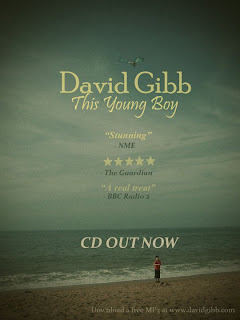
A few weekends ago I went to Chichester with my family to visit my grandma, whilst there we went to the beach and I took a few photos of my cousin playing on the beach. Where previously I had intended to use shots of landscapes and illustrations for my print production I know thought these images would be perfect to use and extremely fitting to the song title "This Young Boy."

These are the my two favourite shots of those taken, and I intend to use one for my advert and one for my digipak after they have been edited.


The parents of the child photographed have consented to its use.

Friday, 3 December 2010

Research & Planning: Digital Technology Conclusion

This week I set myself three targets, however I have only been able to achieve one of them. This is because it took longer than I thought to recreate the split screen effect. After looking a tutorial up on Youtube, my partner and I went outside to experiment with the video cameras.        
                                                                                                            
   To achieve the split screen, you need to film a scene  
  with something in it, then the scene again with the 
  object or person moved, however it is vital that the  
  camera is kept still otherwise the shot will look 
  disjointed. This is something we could have improved 
  on as we didn't know how to attach the camera to the 
  stand and so the final shot has turned out a bit shaky.
  We will need to learn how to attach the camera to the
  stand before final filming.


After getting the shots we edited separately so we were both able to improve our skills. I imported the videos into Adobe Premiere and lay them over each other after cropping one of them to the right. Something I found difficult was matching the objects in the picture e.g. the lamp post, but this was quickly resolved through changing the sizes of the shots.


This is a montage of the videos I created showing my experimentation with split screen and focus pulls.

Thursday, 2 December 2010

Research & Planning: Location Shots

This week Jess and I went into Nunnery Wood in order to take some location shots. Although there are more attractive woods local to Worcester, we've chosen Nunnery Wood as it is right by our college therefore being the most convenient for filming as well as being a pleasant wood.

When we ventured deeper into the wood we discovered somewhere perfect for one of the last scenes of the video where the boy enters a clearing and is surrounded by the dead people he saved.  


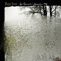
After taking all the pictures needed for the location, I then had time to take a few shots for my print production. I particularly liked skyward shots of trees like that of Bon Iver's albums and so tried to recreate my own.


Obviously they need editing, but I plan to use these images for the inside covers of my digipak.

Monday, 29 November 2010

Research & Planning: Digital Technology Targets

In order to create the effects I want in my music video, I need to develop my skills with the digital technology which I have assessed through producing three targets for myself. This week I aim to:

  • Achieve the split screen effect using Adobe Premiere.
  • Create an over saturated effect with colour filters also using Adobe Premiere.
  • Learn about the different effects layers can create in Adobe Photoshop.

Sunday, 28 November 2010

Research & Planning: Magazine Advert Analysis

 Due to the fact that folk music generally is quite niche, i've found it quite difficult to find examples of magazine adverts showcasing it. However, through analysing those that I have managed to find (and those which are more mainstream that I would have liked them to be) I've found that the genre uses both illustrations and photographs as the main image. I would like to experiment with using illustrations or photographs for my advert and get audience feedback for which would be most suitable.


As for the text, as with the digipak, it almost always is in italics and has that handwritten feel to it. The name of the band/ artist is the largest text on the image. 


Saturday, 27 November 2010

Research & Planning: Print Research

From my research into similar artists' digipaks I've discovered that folk artists tend to either go one which is illustrated or one including a shot of something natural.


This digipak is quite redundant as there is a direct correlation between the title and the album artwork. However the use of illustration and the scribbled technique makes it quite quirky.


Here a simple shot has been used, however I  think it's really effective I particularly like the contrast of the black and white as well as the teared effect on the edges of the image. It also shows how folk artists use scenic images as well illustrations in their album artwork.


Again here is an example of an illustrated design. Something I've found with folk bands is that they don't tend to use an image of the artist as the front cover, it's used here but only as an illustration.


Due to the fact that there is a crossover now between the folk and indie genres, many folk artists have chosen to stylize their album artwork like that of other indie music. Here the artist has tried to present an image that cohers to the auteur theory (not being influenced by the mainstream and having individual ideas from their creativity alone) however the once niche indie scene has grown significantly in popularity and images like these can be seen anywhere making them much like Adorno's theory in which popular music products are characterised by standardisation.
I would like my own print production to have a vintage effect and have found some useful information on a photoshop tutorial website.

Research & Planning: Costume Design

From our ideas and rough sketches, Jess came up with this:

Friday, 26 November 2010

Research & Planning: Reflection On Time Management

This week Jess and I have been hard at work producing our storyboard. We had originally planned to get it finished for today however we were unable to do so and will have to run into next week. This will then mean we have less time to turn the storyboard into an animatic next week or if we are then unable to get that finished we will have to modify our calender.

Research & Planning: Creativity

For this past week I've been focused on developing my creativity. Sir Ken Robinson said that we are all born with creativity and it is then society and focused schooling that then hinders it. He says that we are taught to become scared to make mistakes and subsequently too scared to be creative. However I don't agree with some of what he says, I think it's through our interaction with the world that inspires our creativity. 

Over the past few days I've been thinking and drafting up some ideas for my print production; below are some examples.
I got the inspiration for these on a walk home one day, where I properly looked at my surroundings. Through my research into other folk artists' albums I've noticed that many are illustrated, like that of Willy Mason, so I decided to give it a go myself. 
The illustration on Willy Mason's front cover has a scribbled effect, and I tried to recreate this by using a technique a friend told me about. Using a fine liner pen, I scribbed my design on paper before outlining it by dabbing a wet paintbrush over the image creating this washed out effect.

My partner and I have also got to work drafting out some ideas for costumes, we took inspiration from those that we had seen in The Wickerman, as well as the other music videos we had looked into. 


Research & Planning: Feedback From Target Audience

Feedback From Pitch
After presenting our pitch to our classmates we received anonymous feedback on several aspects of our concept. As a whole the audience thought the suitability for the target audience was good, saying it was "realistic", "well researched" and "ideal." They also thought our idea was original, saying it sounds "interesting", "different" and "entropic", however there were a few comments that said our concept sounds too similar to Mumford & Sons, which I disagree with as they are a mainstream band whereas ours is more niche and includes much darker themes. I do understand though how our location could seem too similar but that, I think, is inevitable. 


There were quite a few comments on the difficulty of our filming in the woods, saying how with poor weather conditions the wood could become muddy. This we know is a problem and would be with anyone filming outdoors, we'll just hope that the weather is on our side. We'll also have to be careful with any safety hazards as there are many places in the woods where someone could fall or trip regardless of weather conditions. Another technical aspect that was unanimously critiqued was the difficulty the prospect of hanging people was. Originally we had hoped to have long shots where you would see several hung people in the wood, however after talking through the options with several people we've decided to just include very tight, specific shots where you'll never see their whole body at one time. This will mean the actor can stand on a chair, when we need their head in shot, or use their arms to hang from the tree when it's only their feet needed in the shot. 


The audience was also asked whether they thought the idea sounded realistic - did it sound like a music video? A few people said the lighting would be hard to achieve with the college cameras, but we intend to create the right lighting in post production using editing techniques. Someone also said that we need to include more close-ups of the musician, which we agree with and have taken on board.  

 Feedback From Focus Group

To get feedback for our music video plans so far from our target audience, Jess and I created a Facebook note including the finalised concept, the song and a list of possible costumes and locations we could use. At the bottom of the note we asked five questions that could tell us whether we were on track and creating something relevant to the target audience as well as any improvements that could be made. The questions were:

1. Would you recognise this as a folk genre music video? Why/ why not?
2. Do you feel that this video targets your age range? How/ why?
3. Does this sound like an authentic video that would be broadcast on TV? Why/ why not?
4. Would you watch it? Why/ why not?
5. How would you improve it?


We then tagged several typical audience members in order to get a relevant response.


The feedback was very positive towards our choice of setting and appearance of our video and the audience could identify the genre of the video easily due to the stereotypical conventions we included (e.g. the woodland setting) meaning the genre, as Chris noted, could be deduced even without the music.

Two of the three suggested that we shouldn't have a specific age range to target and that it should be more generalised, however Jack, the youngest of the three suggested that people his age would be more interested in the mainstream. This has led Jess and I to think that we should be aiming our video at a more mature audience.

Chris also suggested that we should lose some of the repetition of the untying of ropes unless we can find different ways of doing it. This comment will prove very useful when filming and editing as we will now be more aware of the interest in each shot and will help our video become less redundant.

Wednesday, 24 November 2010

Research & Planning: Investigating Chosen Genre (unfinished)

The genre of music my partner and I have chosen to explore is folk. Being a folk fan myself I already had a vague idea of the type of song I wanted, I also knew where to look for key artists and concepts behind the genre.


Mumford & Sons: Winter Winds


E.g. Cheesy slow motion

Although this artist is much more mainstream than our chosen one, OTT cheesy long shots of the band in slow motion being an example of something we wouldn't want to recreate, there are a couple of ideas and shot types in the video that we want to take on board. I love the use of setting such as where the main character is walking through the long grass with a low angle shot and the strands of grass, unfocused and brushing the camera lens, making an effective shot.

Bon Iver: The Wolves Act 1 & 2


This artist is much more niche than the one described above, but much darker than the artist we have chosen. The video is based on nature with parts of the video having a Blair Witch Project feel to it. I particularly like the shots of trees and the fast paced cutting at the end of the video.
I've also found that Folk can play a big part in the atmosphere of a film, for example, The Wickerman. Originally filmed in 1973 The Wickerman uses folk as a juxtoposition; the happy track teamed with the singing & dancing villagers; their joyous faces against the slow, painful death of an innocent man. This effect is something my partner and I would like to attempt to portray in our music video; the use of a happy mise-en-scene over a sinister event.

http://www.youtube.com/watch?v=UEOQqnHMSMc


Thursday, 18 November 2010

Research & Planning: Final Concept

This Young Boy
Finalised Concept

Main character pushes his bike up the path (no music). Arriving at the top of Red Hill Lane, he looks around. Pan shot of landscape around lane (POV). He climbs on his bike and, kicking off, the music starts. From different points of view, we watch him cycle down the lane. As he nears the railway bridge, the lighting begins to shift and become more surreal. As he rides beneath the railway bridge, the image is blown out with light, and we lose visuals.

He is suddenly in woods, the lighting dark, but with concentrated colour. He looks around. Canted angles, circling tree shots, more POV. He begins to walk the path, still singing. He halts. There is something dark and out of focus behind him. Shift focus: from main character, to body, back to him, to the foreground, where rungs of ladder can be seen. He calmly reaches his hand towards the ladder without looking at it. He turns, the ladder tucked under his arm, and approaches the person. He props the ladder against the tree beside the body and begins to climb. Close up of hands undoing the knot on the branch. See the rope slip away (slow motion). POV of looking down over the branch, see the body splayed on the ground. Low angle shot looking back up at the main character in the tree who begins to climb down. Back to the first high angle shot of him leaving the ladder. Picks up body and props it on its feet. Close up of face, eyes opening suddenly. The revived person follows at a distance as the main character picks up his ladder, sticks it under his arm and walks away.

Switch to storyline 2. Lighting is bright and warm. Establishing shot of rolling countryside taken from inside a car (Note: when shots are taken from inside a car, this is a family holiday video – handheld shots). Also shots of the countryside around. See car in background. Sound of song is lower. Radio turned up and sound returns to full volume. Long shot of location, car goes by, zoom in on a tree.

When zoomed out, we are back in the wooded location. Side shot of main character leading a procession of about 4 dead people. Time begins to move faster, and in a series of faster shots, we see repetitive actions of him placing his ladder against various trees, his hands picking at knots, the bodies dropping. From a low angle, only the newest dropped body is seen, and the feet of others in the background. The main character leans into the shot and helps the new person to their feet. As they rise together, the camera follows until, at normal height, the camera is looking across a crowd of people.

The bridge begins. The main character is alone in the centre of a clearing. The camera circles him. As he looks around, the dead emerge from the trees. This is intercut with a short fragments of the continuing storyline 2, shots of the car turning into an estate, shots of inside the car with the family laughing. Then back to the main storyline. People continue to emerge. This continues in this manner until they, at a distance, surround him and begin to slowly dance around him, circling. The camera spins from the centre of this, flashing past each face.

They stop, and the circle parts. The main character’s eyes fall on something out of shot and, the crowd of the dead split into two equal ranks on each side, they follow him, though the camera angles deny the viewer of what he is seeing, showing him approaching the camera from a high angle. Finally a reverse shot is provided, a close up of dangling feet. There’s a shot back of the main character, whose eyes travel up the body. In splitscreen, he looks at the face – it is a dead version of himself. He steps backwards, out of shot. There are still interrupting shots of storyline two. Slowly, he climbs his ladder. As there’s another close up of his hands on the knot, and it releases slowly.

As it does so, there’s a final sequence of the car, turning a corner, and travelling down a short road. Jumping to inside the car as it approaches the bridge, we see the main character on his bike, going underneath the other side of the bridge. It cuts back to the body falling the final foot to the ground as faint sound of the car brakes screeching is heard. A high angle POV from the branch looks down at the body, and the crowd of dead watch. From ground level, we see the dead version of the main character’s head and shoulders. A match-on-action, we then see the boy in the clothes he wore at the start of the video, lying in a similar position on concrete, the wheel of his bike spinning in the foreground. In the last moments, after lying still as if dead, he opens his eyes.

Tuesday, 16 November 2010

Research & Planning: Time Management

The Outlook Web App that students use to communicate with both teachers and eachother also has a calender feature, allowing me efficiently organise any outstanding tasks I may have. The calender also has the option to be shared meaning, so long as I know their email, I can add anyone to my calender so they can view and add to it too. This is perfect for organising our team and will prove especially useful in the future when we need to organise filming.

This is what we hope to achieve through the rest of November:


And December:


We also completed a more thorough plan in Word:


Sunday, 14 November 2010

Research & Planning: Tempo

I chose to analyse how the tempo of a song affects the amount of shots in a music video to help with the production of my own.


Firstly I looked at indie band Bloc Party and their song "Helicopter." The song has a fast tempo which is amplified in the amount of shots - in the first minute there were 107 cuts making it have an average of two shots per second.


The number of shots in a folk video however are quite the opposite. Laura Marling's "New Romantic" has a much slower tempo, which the shot types cohere to in their long lengths and stillness. I counted 14 shots in one minute of the video meaning there was an average of a shot every 2.5 seconds.


However the folk song my partner and I have chosen is a slightly more upbeat folk song and so  there should be on average a shot per second. This is because our video will contain both stop motion shots and a dramatic increase of shots at the crecendo of the video as well as the slow, scenic shots dotted throughout the video.

Both examples of how the amount of shots in a video reflects the tempo cohere to Goodwin's theory of a music video matching the lyrics to the visuals.

 Though our animatic only contains a rough idea of the shots and timing , this further research has helped me understand where it's neccessary for us to take our time in the video and where we can afford or it would look more effective to speed up. The establishing shots of the video are an example of where it's neccessary for the video to have a slow editing pace, allowing both the character and the audience to take in the surroundings not only so we understand the scene but also to emphasize the scenic environment which is common in folk videos. As the tempo of the track increases, so will the editing and this will also gradually incorporate the second narrative of the car journey. This second storyline with be flickered in before being shown fully, as though the first narrative was overwriting the second on a home video camera.


Tuesday, 19 October 2010

Research & Planning: Moodboard

After settling on David Gibb's song "This Young Boy," we used synesthesia to come up with ideas for the video. Originally we thought of happy themes but after listening to it again we then discovered the darker themes in the lyrics. Almost immediately we knew we wanted to film in a wood and it was then that we came up with the idea of contrasting that of the happy music with that of a darker themed video, and were introduced to The Wickerman (1973). The ending scene of the video was just what we wanted to recreate.

Based on our ideas, we've tried to produce a moodboard that presents the contrast between the light and dark themes.
Saturday, 16 October 2010

Research & Planning: Chosen Artist

After a lot of searching on various websites such as Youtube, NME, Myspace and sites specifically for unsigned bands such as Overplay, my partner and I have finally chosen our artist. Found on Myspace, David Gibb is an unsigned folk singer from Derby. This is his Myspace page
The song we have chosen, also the one deemed most 'folky', is "This Young Boy" which unfortunately already has it's own music video. However, we plan to make our video much different from the original and there will be no coherance between the two.


^ The original video.


We've recently received permission to use the song, the print screen of the email can be seen below.