
This digipak is quite redundant as there is a direct correlation between the title and the album artwork. However the use of illustration and the scribbled technique makes it quite quirky.
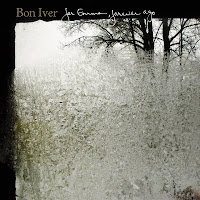
Here a simple shot has been used, however I think it's really effective I particularly like the contrast of the black and white as well as the teared effect on the edges of the image. It also shows how folk artists use scenic images as well illustrations in their album artwork.

Again here is an example of an illustrated design. Something I've found with folk bands is that they don't tend to use an image of the artist as the front cover, it's used here but only as an illustration.

Due to the fact that there is a crossover now between the folk and indie genres, many folk artists have chosen to stylize their album artwork like that of other indie music. Here the artist has tried to present an image that cohers to the auteur theory (not being influenced by the mainstream and having individual ideas from their creativity alone) however the once niche indie scene has grown significantly in popularity and images like these can be seen anywhere making them much like Adorno's theory in which popular music products are characterised by standardisation.
I would like my own print production to have a vintage effect and have found some useful information on a photoshop tutorial website.
No comments:
Post a Comment